Turf – UX/UI Case Study
Role: Designer, Researcher and Strategist
Logo, Branding, Visual Identity, Brand Strategy, UX/UI Design and Digital Design
Turf is a Football Journalism website designed to cover the latest news in the English Premier League. The objective was to provide content for our casual sports bettors that would guide them to our trusted affiliate partners.

User Research & Findings
Before jumping into design or development, we conducted some user research to emphasise with the users. The team remotely interviewed 10 casual sports bettors and gathered 5 participants for usability tests of our other websites and competitors. We then asked them a series of relevant questions such as but not limited to: What are the pain points of visiting football journalism websites? Do you check the other European league tables? Do you prefer team headlines or player headlines?
Findings
The research showed that on our sites our participants mainly browsed the latest news, league standings, match previews articles and post-game analysis. This helped me to understand that some of our sites had pages that were irrelevant to our casual bettors.
Our casual bettors often felt overwhelmed by our tips and odds and wanted a simple solution to placing a bet online.
Their reasoning for placing bets was for entertainment purposes rather than sports betting as a professional endeavour.
Based on the findings, we defined the essential features for the first version of the website.
Defining Initial feature requirements
Create a site for casual bettors where they can access all the features they love
Have a minimal, clean user-friendly design
Make the steps to placing a bet simpler
Ideation & Low Fidelity Wireframes
One of the challenges was to create a user-friendly design that showcased all the features but also had the fewest steps to reach the affiliate’s landing page. We wanted to provide the users with a satisfactory experience while also accomplishing the goals of the stakeholders.
During our usability testing, the casual bettors felt frustrated by big advertisements on the screen. I had to find the best solutions for advertising that would provide a positive click-through-rate for our stakeholders while simultaneously not overwhelming or frustrating our casual bettors - which could increase the bounce and retention rates.
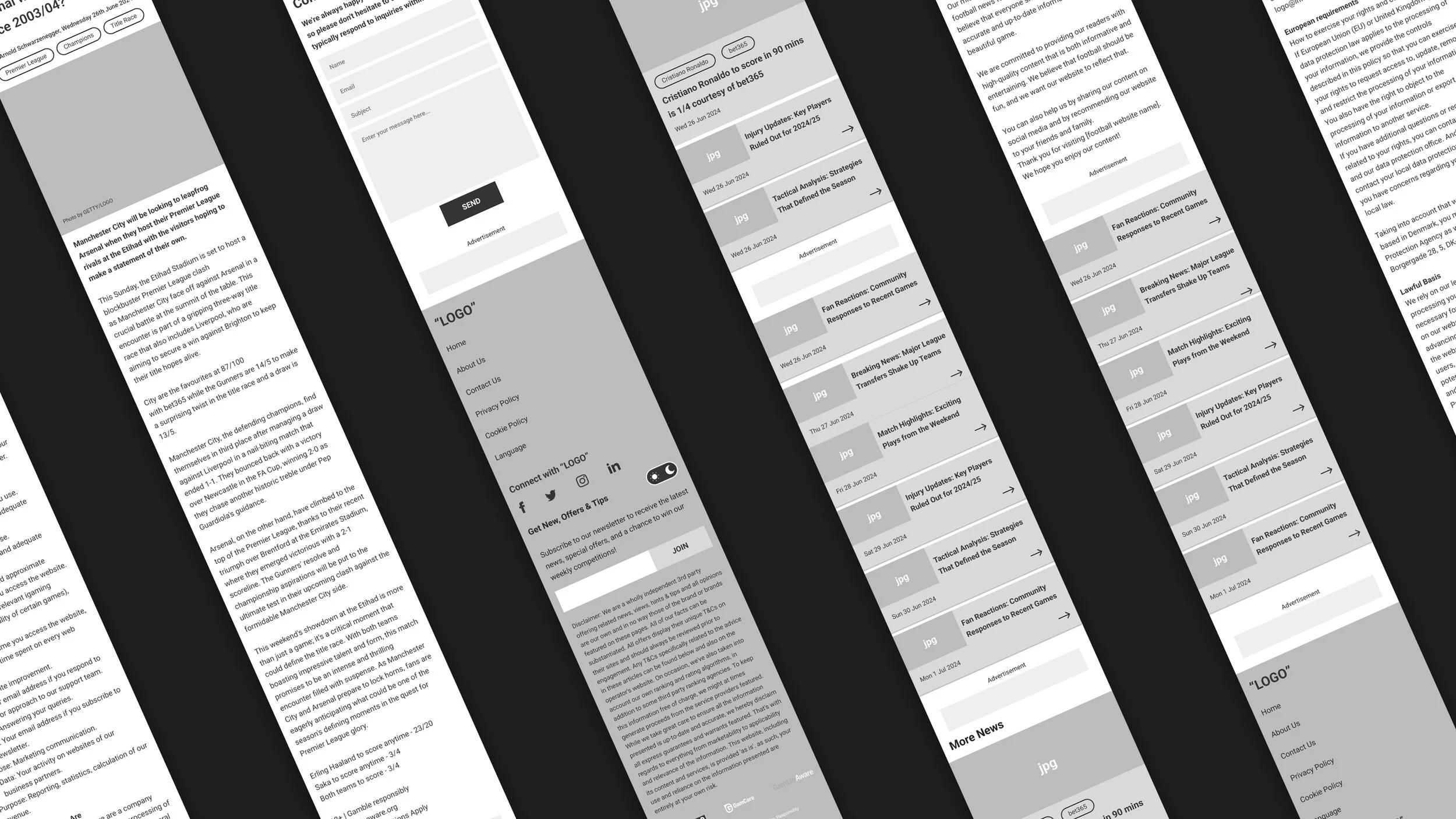
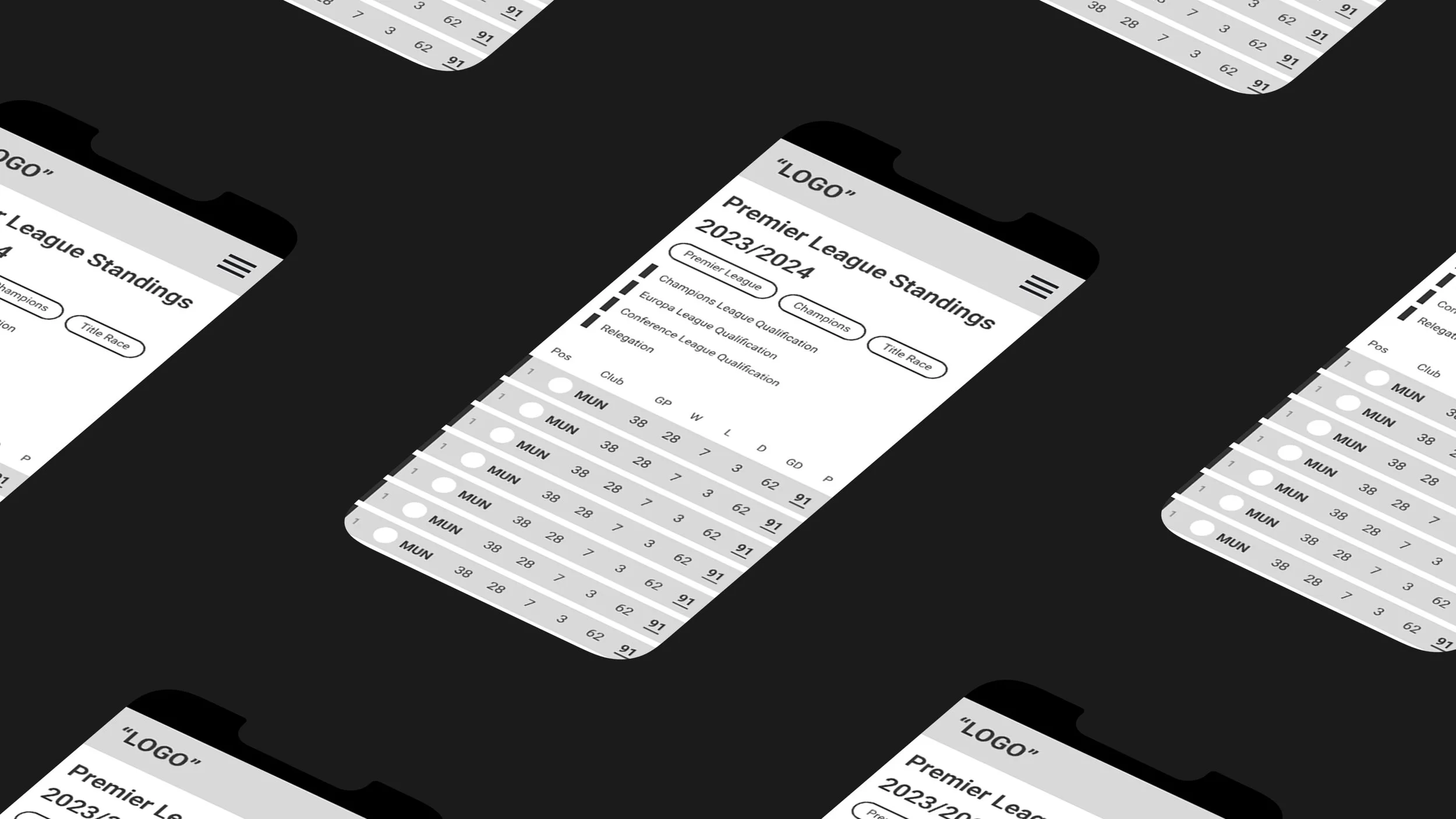
A flow map was designed to streamline the user journey and address pain points found through the user research. I then used the flow map to create low-fidelity wireframes that visualised the experience and supported stakeholders feedback.

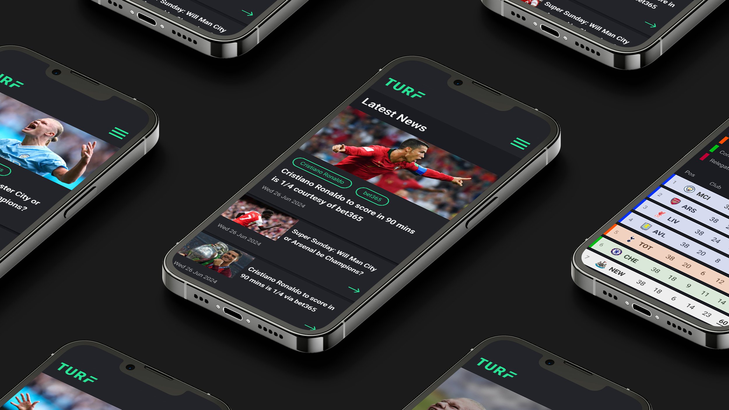
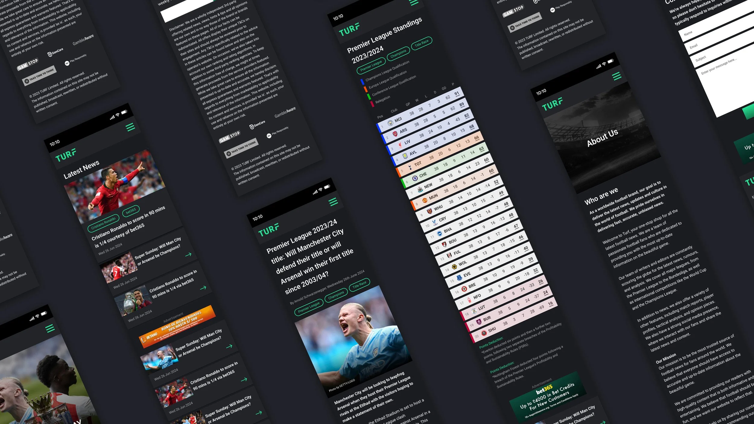
UI Design System & High Fidelity Prototype
The feedback from the stakeholders was positive and allowed us to move forward with some testing and user feedback from some participants.
Initial testing and user feedback helped us to make informed design decisions heading into developing a high fidelity prototype. We had to make multiple adjustments to the low fidelity wireframes, such as developing a ticker for breaking news and adjustments to the spacing and hierarchy.
Eventually we found solutions to improve the user satisfaction and the feedback from participants and stakeholders was positive. Testing the user journey and flow was significantly improved and I was ready to develop a high fidelity prototype.
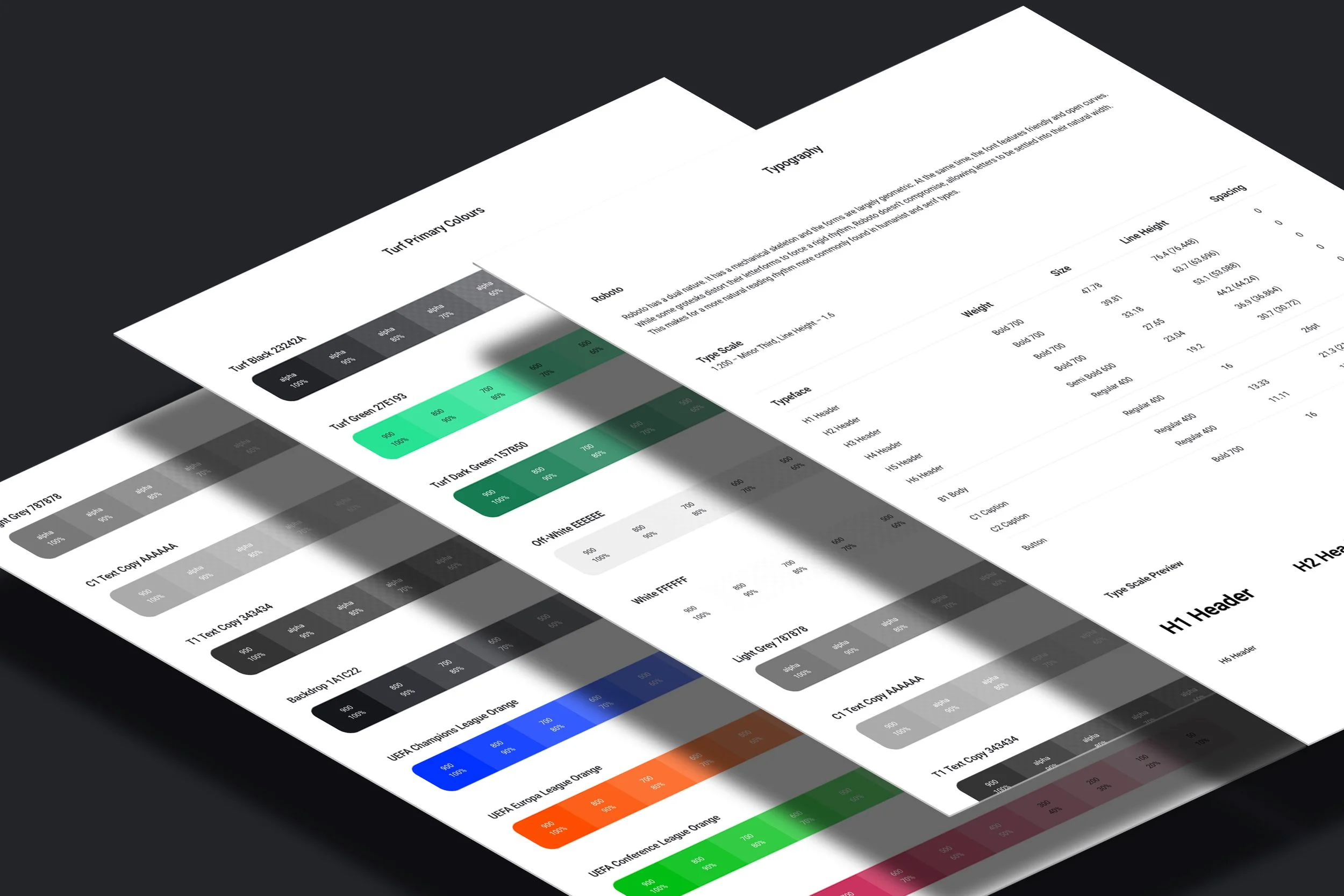
I developed a design system for a consistent and scalable website with reusable components, design tokens (colours, fonts, spacing), navigation, forms and guidelines. The website was starting to look like a real-world product and we could start to get realistic user feedback and stakeholder input once the prototype was complete.
The Outcome
The stakeholders approved the prototype and the feedback from the participants was better than the initial low fidelity wireframe. There was still opportunities for refinement and iteration to ensure a seamless experience, but at this stage I felt that the product was well tested and ready to be developed further.
Although the feedback from our participants was good, we did encounter a few pain points during our usability testing of the prototype which led to some adjustments based on the feedback.
The adjustments we made:
Redesigned the ticker
Adjustments to the global spacing scale
Renaming some of the pages
Expanding the colours for the site
Simplifying the Call to Action buttons
These adjustments helped to improve the user experience and enable a smoother and more cohesive product. The design system will need continuous development and depending on the strategies in the future, new pages and components will need to be added and tested.
The users were navigating the site very well during testing, and overall we had positive feedback on the prototype.
UX/UI Website
For the best prototype experience please use a desktop computer. To scroll down the page, scroll on the outside of the prototype window.